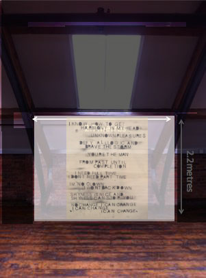
Another element aspect I had to look at was the ergonomics of my work. what I mean is this, I had to think about the throw distance between the projector and the screen and the image and the viewer. The piece will be projected form behind the screen to avoid any hazards during the opening night.
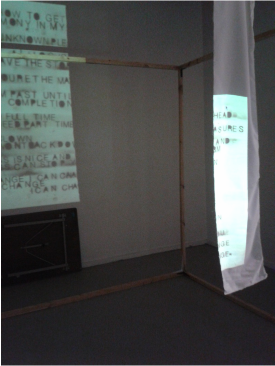
Sourcing materials was a key issue and assembling the actual piece was the greatest challenge. I found that my weakness is in actually acting on my designs and being realistic about how much time I need. Here I gave myself 10 days to play with a Hitachi projector, source the right materials and construct a DIY projection screen. I went and enquired at A4 and more store about what the cheapest fabric to project onto is and it turns out that polyester pongee was the most reliable. Multiple reasons why this was the case: it has a subtle sheen and flatters the image I’m projecting. It also was not so much affected by ambient light which was probably one of the key issues due to the acid lighting in the space I’m using. Finding an inexpensive material for the polyester to hang off became the next technical challenge and I left it last minute. Paul the technician kindly advised and helped me achieve what a thought would be easy. To build a pole that sits between the steel structures on the space that I’ve been assigned. I learnt that things that seem easy are normally the hardest if done properly and without his help and advise I probably would not have be able to construct the projection screen in time.
Another element aspect I had to look at was the ergonomics of my work. what I mean is this, I had to think about the throw distance between the projector and the screen and the image and the viewer. The piece will be projected form behind the screen to avoid any hazards during the opening night.
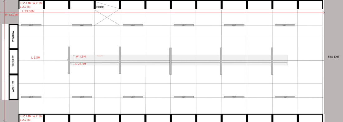
WORK EXPERIENCE- Floor plan for exhibition event. Difficult process and took me 4 hours to do but i have never made a floor plan before so this was a fantastic experience because now i know how.
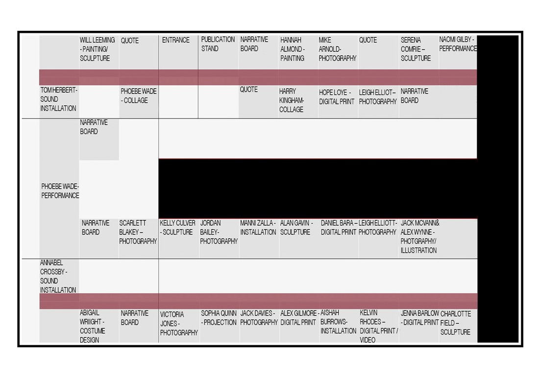
Here is a another floor plan how ever this one i designed for the public to interact with. It designed it for a the brochure with will be given out at the exhibition opening. This took me 5 hours to do.
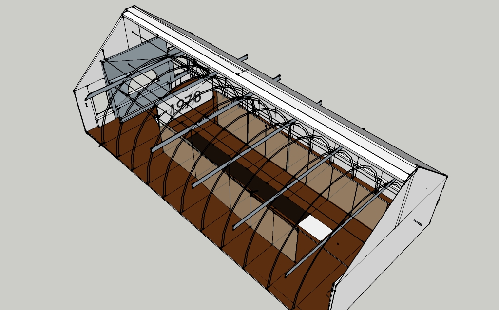
Cad design i done for the curator to edit. This design took me 6 hours to create. the length of time is a bit mad so maybe i need to work under a pressure and i maybe i will work more efficiently.
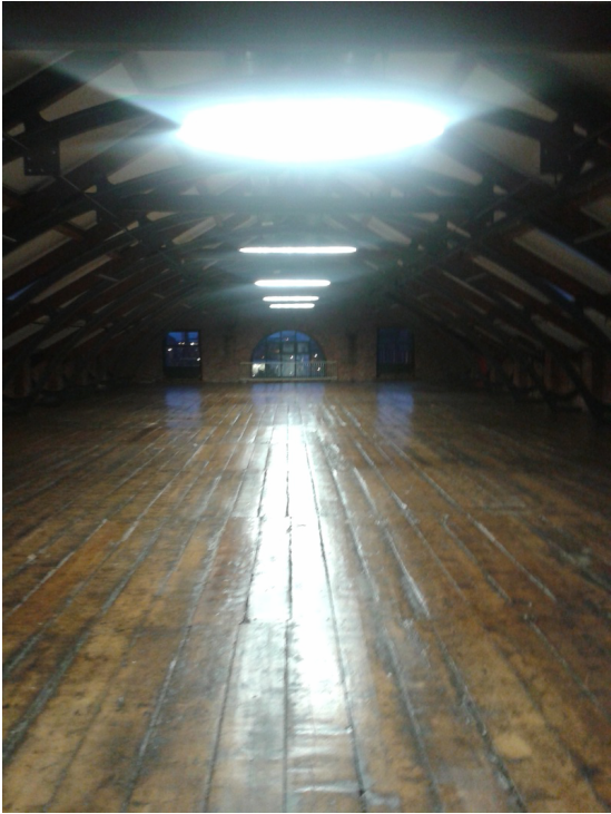
This is the space for the exhibition. The opening is on Saturday 22nd February 2014.
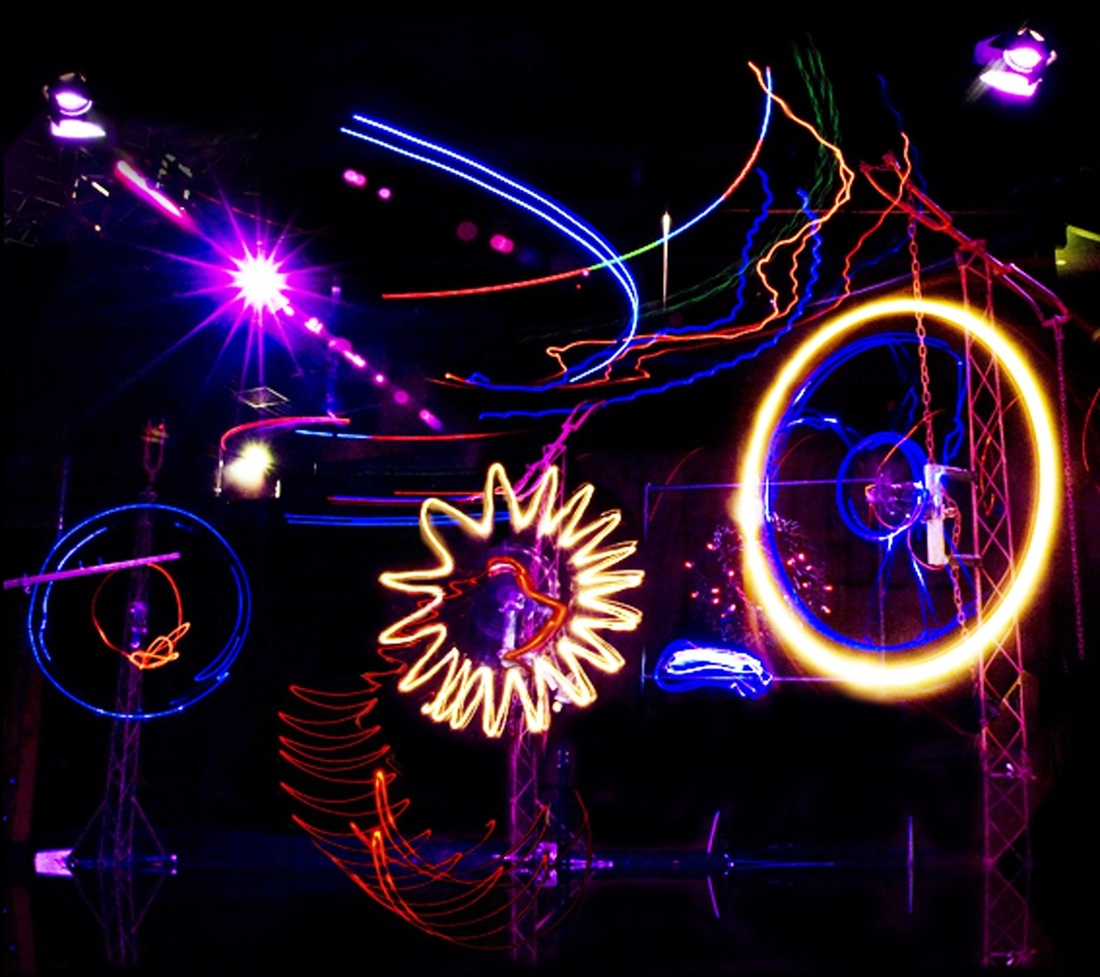
An light installation consisting of lights in motion powered my electric motors. I will be honest and say that the installation looked a bit naff when i first saw in person... however, the collaboration between lights, photography, film and many more forms of creative media. impressive effects made in this collection of works inspired me to play with colour, light and photography/ film.
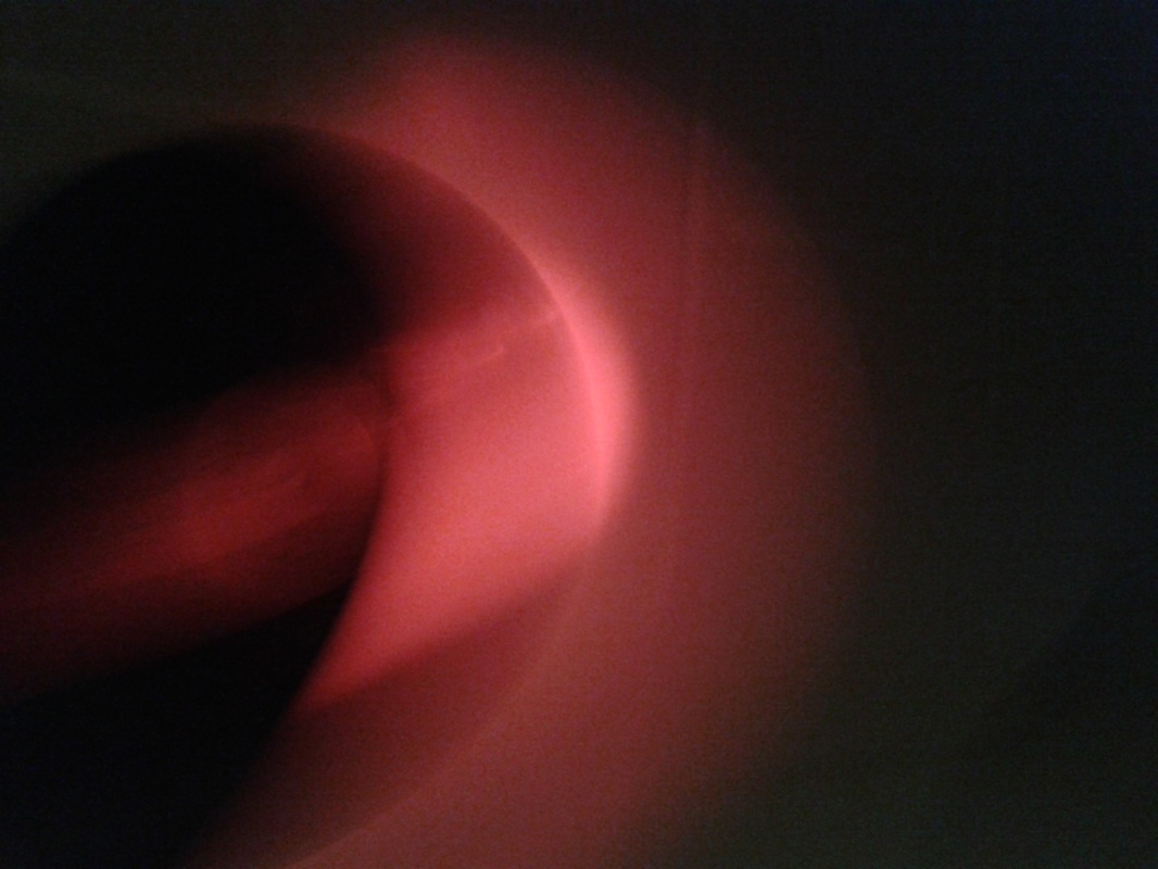
This is my idea: a record (vinyl) red light and slow shutter speed. result:
May adapt to a film experiment based on drug effect
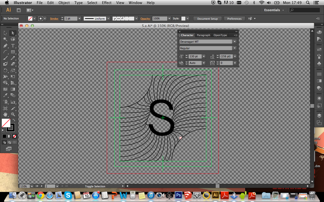
I decided to transfer my designs to a digital format because i wanted a cleaner finish to my designs. these are experimentations. Using illustrator was a learning curb. I have found it incredibly usable in the process of making or editing a piece of design work that i've done or a piece by someone else. for example, i like how i could break down a film into layers that weren't there before would automatically appear with the file. Now this probably doesn't happen with this program but i found it did.
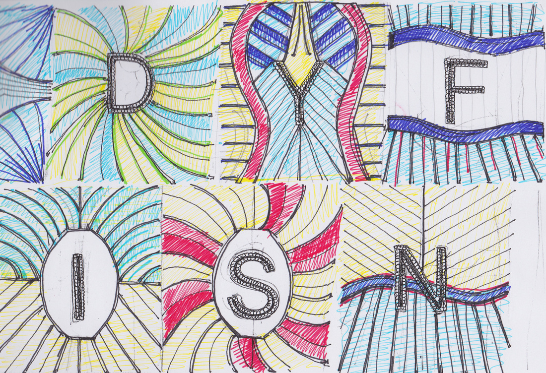
This is a rough sketch of what kind of colours i imagined i would use in my eccentric initials. These colours are bright and mad outrageous styles simply because i want to highlight the fact that manchester music culture, aesthetics, style and history is thus so.
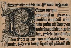
REASON AND INFLUENCE FROM RESEARCH ON ILLUMINATED MANUSCRIPT: -Celestial - the manuscripts were created in gods name from what i understand. They say that music is like a religion for some. - Intense, insane quantity of detail- style of typography is relevant to manchesters mad style and attitude after 1978.
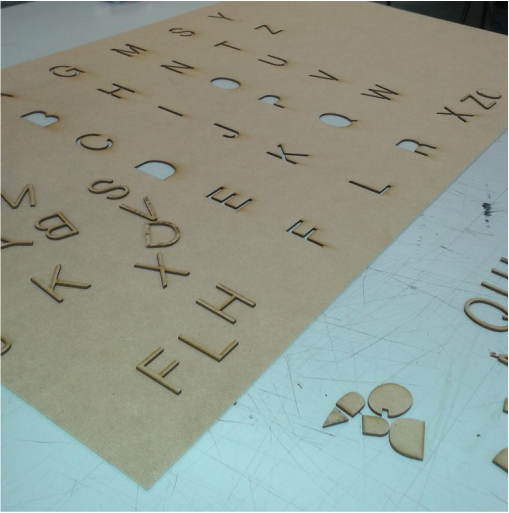
Above are captions of what i intend on doing with the laser cut stencil- lyrics and and there order draft on a larger scale.
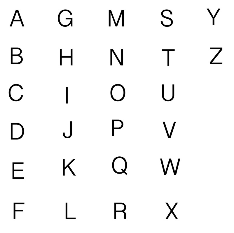
I'm using this simple stencil template so that i can play around with text composition on a larger scale. because the piece will be a lot bigger than 20" x 20". I'm going to draw using the type, design to communicate using a range of mediums... we will see.